
You don't need to purchase expensive fabric for fusible appliqué. I really advise against it when you're learning. Fusible appliqué should be the cheapest thing you can make in quilting. Wal Mart has a decent selection of fabric under the Creative Cuts and Waverly brands. A fat quarter only costs $0.97. A 21 count bundle of 5" squares is $4.95. A strip bundle is $6.77. A fat quarter bundle is $11.69. Solids are $2.97/yard. You really can't beat the price! If you're making a wall hanging or table set, you can make them for pennies. If you want to purchase designer fabric, connectingthreads.com has the best prices. Start with something small or whimsical to learn the technique, and then move onto something more advanced.

Pellon Wonder Under is $1.77/yard, but it's only 17" wide. You'll need at least three yards if you have a lot of pieces to cut. However, brushing a thick layer of washable glue on the plastic side of freezer paper is more cost effective. The glue sticks to the fabric and the paper shape is reusable with another coat of glue.


Fabric Stabilizer (Perfect Sew): Add 1/2 teaspoon of clear Dawn dishwashing soap and 2 ounces of Elmer's clear washable glue to 16 ounces of cold water. Stir to combine. Spray on or soak fabric until wet. Allow to dry until damp and iron stiff. Stabilizes foundation fabric and appliqués.

Lay freezer paper, paper side up on the traced mirror image. Trace the whole image first, and then trace the individual shapes that will be layered on top of it.

Mark the shapes according to the color of fabric you'll be using for them.

Cut out the shapes so you can place them on the fabric where you want them.


Bend the piece where it's cut and the paper will pop up.

Use the original traced image right side up as a placement guide.

Layer the pieces and dry iron again. Press and lift the iron. Gliding it will cause the pieces to shift.


The tulips have more petals than what I cut out. This was intentional. I didn't want all one shade of red, but I don't want solid pink either. You can go overboard with fusible the same as you can with paint. Combining the two gives you the best of both worlds.


Next, I made something like an angle ruler. I cut two 12" strips from a sheet of poster board. I also cut two 24" strips for large projects. Poke a thumb tack through one end of both strips. Bend the tack with pliers and clamp it down.
Use a large paper clip to hold an angle.

Natural light only shines straight down at high noon. Any other time of day or night, it shines at an angle. Use the angle ruler to find where light will hit an object. This is where the highlights will be painted.
The bottom edge of the ruler should be in line with the bottom edge of the image. My photo is a little crooked. Shadow always appears opposite light, outside of it, and beneath it. Every object casts a shadow, both on the background and on surrounding objects. The tulip buds in the image are below larger tulips so they should be a bit darker. Everything outside of the angle receives light, while everything inside of it doesn't.


You may mark the original image showing where highlights, midtones, and shadows are located.

Natural light is always white. Living objects absorb light and show a lighter variation of color. Inanimate objects, particularly metal and plastic reflect light and show the color of light that hits them. Water in the air refracts or scatters light and shows a prism of color. Light passes through water on the ground or in an object and shows what is beneath or behind it.
There is no such thing as a variation of white. These variations always contain color and are best used as soft shadows for indoor objects under artificial light. Incandescent light is yellow. Fluorescent light is blue. Soft white is gray. A heat lamp is red. A black light is deep blue or purple. Light can cast a shadow of any color that is in front of it, so you can really use your imagination on indoor objects.
Now that you understand light and shadow, it's time to pick your paint. Use fabric scraps to find shadow and deeper midtone colors. Use white for the highlights.


Painting your appliqués is optional, but it really gives them depth and dimension. You'll need craft acrylic or traditional watercolor and water in a 2 oz mister. You'll be using the watercolor technique. A drop of paint must be diluted with three spritzes of water to make it transparent.


This is a small project, so I'll be using a #2 flat brush. Dip the brush in water to soften the bristles and blot excess water. Dip only the tip of the brush into the paint. The color will travel up the brush. Water bleeds so you only need a tiny amount of paint for covering a small area.

Paint the background first, then the shadow, and the line last. I used a 00 script brush for the line separating the dark pink background from the pink in the foreground.


Now, you can see how a little bit of paint makes everything stand out.


I removed the freezer paper and card stock in one piece.

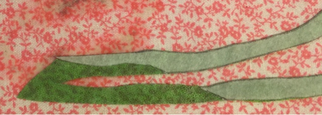
I painted over some of the grass with Kiwi and filled in shadows with Marsh Green. Grass is never one solid color.

I marked and cut a line where I will insert the tulip.

I removed the freezer paper from the tulip.

I inserted the tulip into the cut.

I ironed the entire piece onto the background fabric.

I painted more grass to fill it in.

I made another grass appliqué to fill in space between the tulips. I placed four tulip bunches on this quilt.

Each appliqué turned out a little different so I cut the extra grass where it met the grass on the tulips.


I used Diva Pink with retarder medium for the butterfly and fused batik fabric inside the wings.


The last thing I did was steam set all the appliqués front and back. Adhesive only serves to baste the appliqués which is fine for a wall hanging, but a quilt has to be stitched.
My next task was securing all these appliqués with a satin stitch. The setting on my Brother machine is #4, width = .5; length = 2.5. I used a 76/11 Schmetz embroidery needle and Coats & Clark Dual Duty XP thread. I sprayed stabilizer onto the foundation fabric, allowed it to dry until damp and ironed it to stiffen. A satin stitch for appliqué needs to be a little loose. It isn't like embroidery or monogram. It's okay if fabric shows through the stitches. Let the machine run at its pace. I normally sew at half speed anyway. It's better to sew slowly and have your stitches look neat and uniform than to let the machine get away from you and end up with sloppy stitches. Good quality takes time.


Front Back

Finished tulips


Front Back

Finished butterfly

Finished tulips and grass

I used different colored thread for the leaves, stems, and grass. You can see how each color accents the highlights and midtones. The threads also bring each blade of grass to a point, making it look more realistic. Lastly, I snipped all the stray appliqué threads close to the sewing threads.

Closeup of the finished bottom.

This is the finished quilt.
No comments:
Post a Comment