

I use coloring books to practice and develop my art skills. So many people have asked me how I achieve certain effects, that I wrote this series of tutorials.
Since I'll mostly be focusing on pencils, I thought you might need to know how to sharpen them. It's not as easy as grabbing a standard pencil sharpener. Pencils come in different sizes and hardness. Some techniques require a short point or long point and it takes a special sharpener to get the required point without eating up the pencil.


Prismacolor sells a sharpener designed for colored pencils that produces a long or short point. Derwent sells a battery operated electric sharpener that will sharpen various diameters of clutch pencil lead. The Acurit Dial-A-Point is designed to produce five point types for graphite sketching pencils. Lastly, there's the old standby that will sharpen almost any size pencil.

The sandpaper block is used to create a point on a pencil that has enough of the core exposed that it doesn't need to be sharpened. It's more economical and especially useful for coreless pencils. I also use a craft knife to whittle the lead to a point.

Blue tack adhesive is used for lifting wax and the first three layers of colored pencil. Pull off a small piece and roll it into a ball. When it stops lifting, stretch it and roll it again. Repeat as many times as you need to. One ball will last quite a long time.


If you want to remove 90% of the color, lift it with the blue tack first. Then, use a sand eraser to remove the remaining color and restore the tooth.
A Swiffer duster is used for removing residue from the paper without smearing. Static electricity picks up the pencil dust.
Now, I want to discuss two different types of colored pencil--wax based and oil based.


Prismacolor becomes muted when mixed with white while Polychromos retains its brilliancy. I expect a color to become lighter when mixed with white, so I prefer Prismacolor for this. Polychromos blends as easily as an oil pastel. The special blender pencil dilutes the color with more oil which lightens the color slightly and aides blending. Prismacolor requires a solvent to remove wax build up that would prevent any further coloring. Oil doesn't cause a problem with the paper. I personally don't own any of the Polychromos pencils, but I found a blog by another artist who uses them extensively and wrote a comparitive review of Polychromos vs. Prismacolor Premier pencils. Read it on Colour Your World.


Mixed media is exactly what the name implies. It is using more than one type of media in a composition. Tiny dots are easier to achieve with chalk paint than with pencil or watercolor. How to use each type of media and in which order can be a challenge. Any dry media and acrylic can be used over watercolor. Different dry medias can also be used together. Colored pencil is often used with graphite. I like to use chalk for backgrounds because it's more economical and any media can be layered over it. For the coloring page above, I used chalk as the background applied with a cotton swab and blended with a cotton ball. I erased all the parts that would be colored with pencil. I used white pencil to create highlights. I layered two colors and used a blender pencil to combine them. I painted the cup last with white chalk paint.
Learning Control
How you hold the pencil matters a great deal. Varying the amount of pressure effects the color saturation. Layering is achieved with gentle strokes while holding the pencil almost horizontally so the widest part of the lead touches the paper. This method preserves the tooth and allows the maximum number of layers to be applied. It also preserves the lead. A lot of color is wasted by using the point too early because the tooth can only absorb so much wax before it is ground smooth. Only use a sharp point for creating texture; use a dull point for burnishing.


Getting to Know Your Pencils

This Bee Creative Mixed Media Paper (93lb, 150gsm) is ideal for printing because it is 8.5x11". Get it on eBay for $17.83.
Download one of the pdfs in each section and print it on mixed media paper. You can print on both sides to save paper. Do not scale to fit the paper. The margins are intentionally set outside of the printable area to maximize space and not waste paper.
Color Catalog

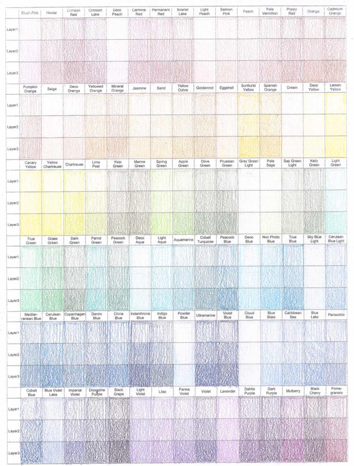
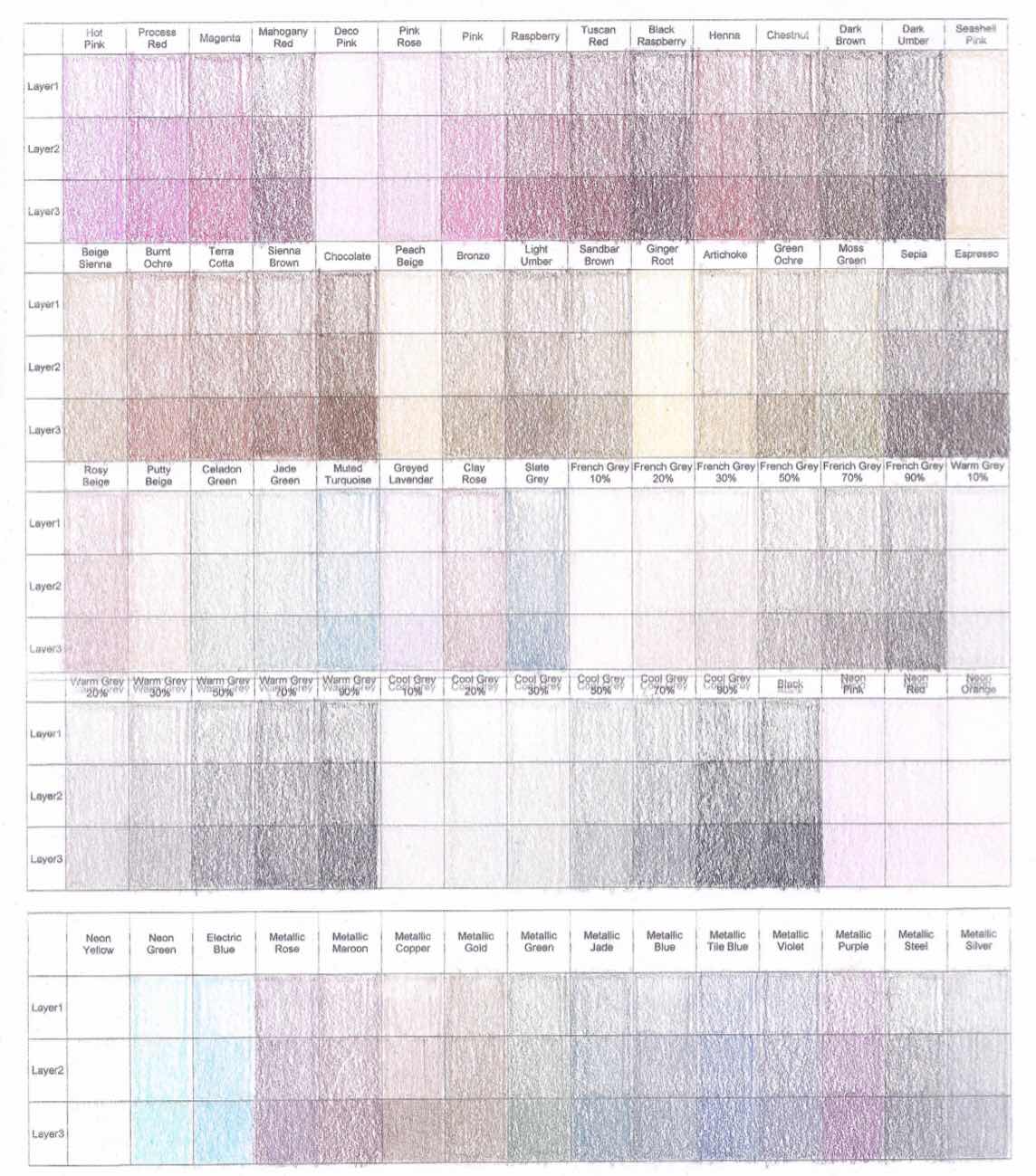
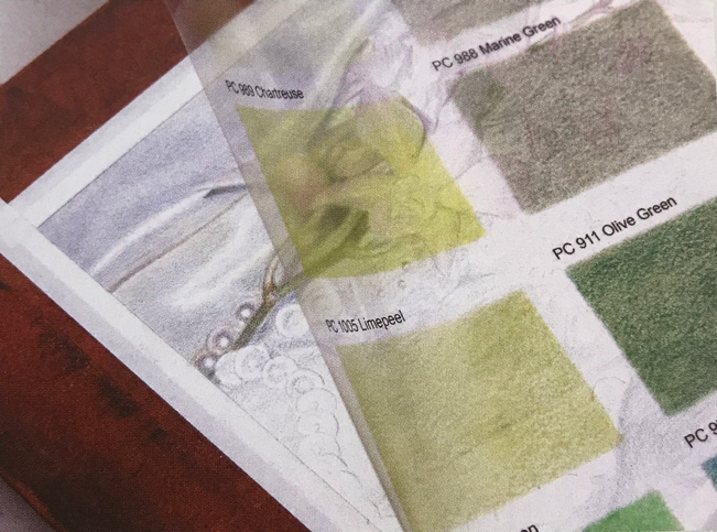
I organized this Prismacolor catalog from warm pink/true red to cool red. Some colors are stand alone transitions that were difficult to place. The olive greens (Moss, Kelp and Marine) were the most difficult because they don't flow within the spectrum. Each color stands alone. Some colors in a spectrum have a deeper saturation and you'll think they don't belong there. I placed gray tone colors at the bottom beside the other grays. If you're ever in doubt where a color belongs, burnish it with white. The dominant color will show. Prismacolor once sold neon and metallic colors, but they have been discontinued. I included them because these colors are still available as generic sets.
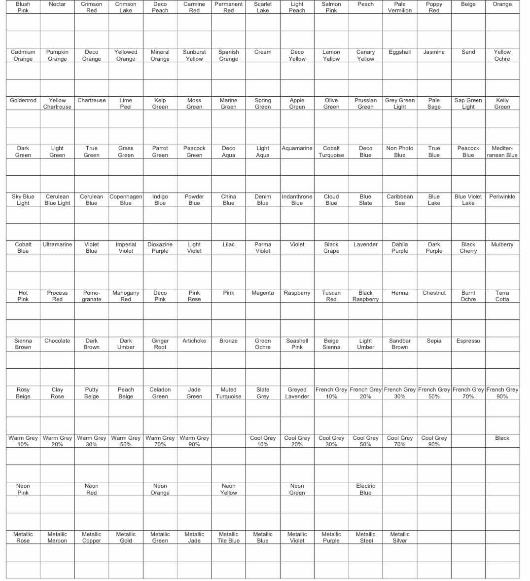

Color in the top squares with light pressure. Color in the bottom squares with normal pressure. Blend both with either a blender pencil or white. If you're organizing pencils that aren't Prismacolor, you may want to print two pages of the blank catalog. Cut out each individual square of one sheet after you've colored it. Organize the little squares until you have the colors where you want them. Color in the second sheet accordingly. This will save you from wasting paper and ink if you make a mistake.

This Color Charts book will help you see and compare all the colors in multiple sets. Get it on Amazon for $7.99.
Color Wheel

Artists use the color wheel to predict how their colors will blend to create new colors. The basic color wheel involves blending primary colors to create secondary and tertiary colors along with their complements. This Prismacolor wheel is different because the set already contains secondary and tertiary colors. I included lights, darks and browns as well. Each primary color is blended with its complement in 4 increasing layers to create a perfect neutral at the end. The interior circle is the primary color blended with dark brown to deepen the saturation. The outer circle contains a middle color between two primaries. That middle color is blended with each primary.


Completely fill the circles with pure colors first. Don't leave any white showing. These colors will not be blended. Fill the inner circle with one layer of dark brown. Fill each brown circle with one layer of its coordinating primary color. Use a blender pencil to combine the colors. Let's look at Canary Yellow and Dioxazine Purple. The row of four circles in front of the purple are filled with the purple. The circle closest to purple is filled with four layers. The next circle is filled with three layers. The following circle is filled with two layers. The last circle is filled with one layer. Do the same with the yellow side. Fill each purple circle with one layer of yellow. Fill each yellow circle with one layer of purple. Use a blender pencil to combine the colors. Do the same for all the other complements. Now, let's look at Crimson Red, Magenta and Dahlia Purple. Magenta has two circles beside it. Fill the circle beside purple with purple and the other with red. Fill both of those circles with a layer of magenta. Use a blender pencil to combine the colors. Do the same for all the other tertiary colors.
New Color Wheels

Separating colors into primary, bright, deep, grey and earth tones into their own color wheels will help you see color relationships along different spectrums.
Complement Comparisons
I like to use a complement for a background to make an object stand out. We also tend to see complements beside one another in sky scapes. A blue or purple sky with a yellow or orange sun is common. It’s important to know how your pencils will behave when blending complements. Colored pencil doesn’t always create mud the way paint does, but it can be difficult to layer complements our use them beside one another without them blending. Knowing how complements will blend ahead of time will help you to plan your composition.

 |
 |
| Prismacolor | Blank |
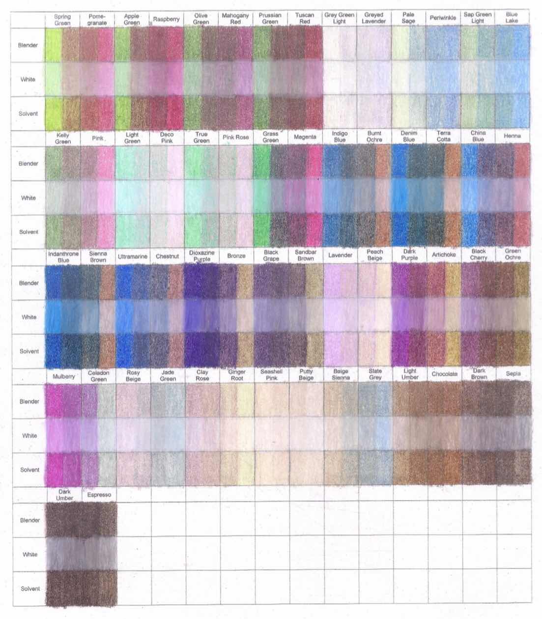
Fill each vertical row with one color and its complement using normal pressure. Layer the opposite color over the first color on the second, third and fourth horizontal rows. Use a blender pencil on the first row. Use a white pencil on the second row. Use a solvent on the third row. I colored mine different. I left half of the squares solid so I could see what the original color looks like.
Layering Templates
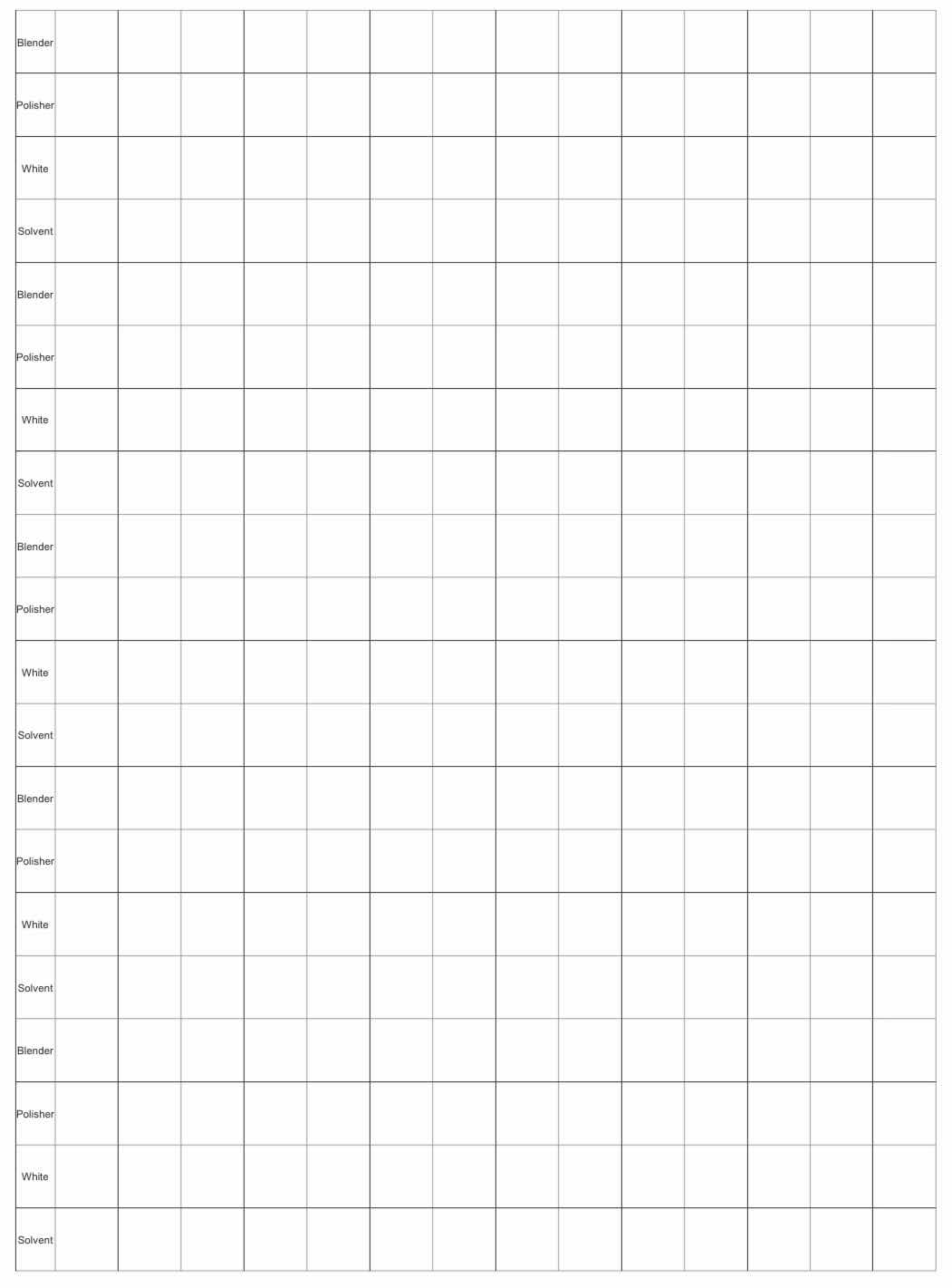
Layering colored pencil isn’t like layering paint because it skips. Colored pencil becomes opaque after several layers, if you’re doing it right. Each layer allows the paper to show through until the paper is flattened or the pigment is diffused with the aide of a solvent. Adding another layer on top of solvent repeats the process. Therefore, it’s important to know in advance how a color will look on top of another with one or more layers.
 |
 |
| Prismacolor | Blank |

Print each scanned sheet on coated acetate, single sided. Place them in sheet protectors with plain paper in between the transparencies. Store them in a binder.
This way, you can see what a layer of color will look like over another color and see what consecutive layers will look like before you color.
Yes they are. I only wish they was more like her blending solvents chart
ReplyDeleteYou can always use the solvent charts for color comparison. Thanks for commenting.
DeleteYou're very welcome!!
ReplyDeleteDo you have a color wheel with all the prismacolor names on it?the one above only has the main ones.
ReplyDeleteNo I don't. You can use the blank prismacolor wheel with your own colors or use it as a guide to make a bigger wheel for all the colors.
DeleteThank you so for sharing your knowledge. I sincerely appreciate!
ReplyDeleteYou're very welcome!!
DeleteSuch great info! Where can I download all these charts please?
ReplyDeleteClick on the link and the pdf will open if you have a Google account.
DeleteClick on the link and the pdf will open in a new window if you have a Google account.
Delete